
Think. Create. Code. Vis! (@edXOnline, @UniofAdelaide, @cserAdelaide, @code101x, #code101x)
Posted: April 30, 2015 Filed under: Education, Opinion | Tags: #code101x, advocacy, blogging, collaboration, community, curriculum, data visualisation, education, educational problem, educational research, edx, higher education, learning, measurement, MOOC, moocs, reflection, resources, teaching, teaching approaches, thinking, tools, universal principles of design Leave a commentI just posted about the massive growth in our new on-line introductory programming course but let’s look at the numbers so we can work out what’s going on and, maybe, what led to that level of success. (Spoilers: central support from EdX helped a huge amount.) So let’s get to the data!
I love visualised data so let’s look at the growth in enrolments over time – this is really simple graphical stuff as we’re spending time getting ready for the course at the moment! We’ve had great support from the EdX team through mail-outs and Twitter and you can see these in the ‘jumps’ in the data that occurred at the beginning, halfway through April and again at the end. Or can you?

Rapid growth in enrolment! But it’s a little hard to see in this data.
Hmm, this is a large number, so it’s not all that easy to see the detail at the end. Let’s zoom in and change the layout of the data over to steps so we can things more easily. (It’s worth noting that I’m using the free R statistical package to do all of this. I can change one line in my R program and regenerate all of my graphs and check my analysis. When you can program, you can really save time on things like this by using tools like R.)

Now you can see where that increase started and then the big jump around the time that e-mail advertising started, circled. That large spike at the end is around 1500 students, which means that we jumped 10% in a day.
When we started looking at this data, we wanted to get a feeling for how many students we might get. This is another common use of analysis – trying to work out what is going to happen based on what has already happened.
As a quick overview, we tried to predict the future based on three different assumptions:
- that the growth from day to day would be roughly the same, which is assuming linear growth.
- that the growth would increase more quickly, with the amount of increase doubling every day (this isn’t the same as the total number of students doubling every day).
- that the growth would increase even more quickly than that, although not as quickly as if the number of students were doubling every day.
If Assumption 1 was correct, then we would expect the graph to look like a straight line, rising diagonally. It’s not. (As it is, this model predicted that we would only get 11,780 students. We crossed that line about 2 weeks ago.
So we know that our model must take into account the faster growth, but those leaps in the data are changes that caused by things outside of our control – EdX sending out a mail message appears to cause a jump that’s roughly 800-1,600 students, and it persists for a couple of days.
Let’s look at what the models predicted. Assumption 2 predicted a final student number around 15,680. Uhh. No. Assumption 3 predicted a final student number around 17,000, with an upper bound of 17,730.
Hmm. Interesting. We’ve just hit 17,571 so it looks like all of our measures need to take into account the “EdX” boost. But, as estimates go, Assumption 3 gave us a workable ballpark and we’ll probably use it again for the next time that we do this.
Now let’s look at demographic data. We now we have 171-172 countries (it varies a little) but how are we going for participation across gender, age and degree status? Giving this information to EdX is totally voluntary but, as long as we take that into account, we make some interesting discoveries.
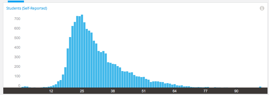
Age demographic data from EdX
Our median student age is 25, with roughly 40% under 25 and roughly 40% from 26 to 40. That means roughly 20% are 41 or over. (It’s not surprising that the graph sits to one side like that. If the left tail was the same size as the right tail, we’d be dealing with people who were -50.)
The gender data is a bit harder to display because we have four categories: male, female, other and not saying. In terms of female representation, we have 34% of students who have defined their gender as female. If we look at the declared male numbers, we see that 58% of students have declared themselves to be male. Taking into account all categories, this means that our female participant percentage could be as high as 40% but is at least 34%. That’s much higher than usual participation rates in face-to-face Computer Science and is really good news in terms of getting programming knowledge out there.
We’re currently analysing our growth by all of these groupings to work out which approach is the best for which group. Do people prefer Twitter, mail-out, community linkage or what when it comes to getting them into the course.
Anyway, lots more to think about and many more posts to come. But we’re on and going. Come and join us!
