
Heroes
Posted: May 7, 2012 Filed under: Education | Tags: advocacy, alan turing, Arland D Williams, Arland Williams, bruno schulz, education, heroes, higher education, inspiring students, learning, reflection, teaching, teaching approaches, turing, work/life balance 1 Comment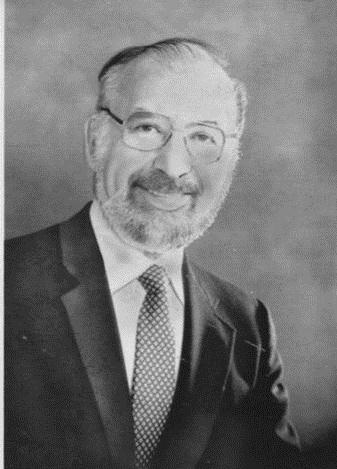
Arland D. Williams, Jr (1935 – 1982)
I know that I learn best when I’m inspired and engaged, so I regularly look for things around me that I can bring into the classroom that go beyond “program this” or “design that”. Our students are surrounded by the real world and, unfortunately, it’s easy to understand why they might be influenced by things that are less than inspirational. I don’t want to be negative, but there are so many examples of bad behaviour on the national and international stage that, sometimes, you really wonder why you bother.
So, today, I’m going to talk about four people. Regrettably, three of them some of you won’t be able to talk about because of personal convictions, political considerations or the ages of your class, but I hope that most of you will either have learned something new or remembered something important by the time I’m finished. Are these people actually heroes, given the title of my post? Well, one is a professional inspiration to me, one is an artistic inspiration to me (and reminder of the importance of what I’m doing), one is generally inspiring in the area of democracy and dedication, and the other… well, the other, I can barely look at his picture without wondering if I could ever approach the level of selflessness and heroism that he demonstrated. But I’ll talk about him last.

Alan Turing (1912-1954)
This is Alan Turing, the most likely candidate for the term “Father of Computer Science”. Witty, well-educated, highly intelligent and thoughtful, he was leader in cryptanalysis at Bletchley Park, providing statistical and mathematical genius to breaking codes including the design of the bombe, the machine that attacked Enigma. Importantly, for me as a Computer Scientist, he developed Turing Machines, effectively providing the foundations of studies in the theory of computation. He provided the first detailed design of a computer that used a stored program, very different from the electrical calculators of the day. He defined some of the key terms that we still use in Artificial Intelligence. (There’s so much more but it wouldn’t mean much to you outside the discipline, but he’s well worth looking up.)
Of course, some of you can’t mention Turing to your students, because he was a known homosexual, with a conviction for gross indecency in 1952 after admitting to a consensual homosexual relationship. He had a choice between imprisonment or chemical castration (he chose the latter) and his security clearance was revoked and he was barred from continuing with his security work. He was found dead in 1954, having (most likely) committed suicide.
There is no doubt that the field I am in is the better (or even exists) for Turing having lived and worked in this field. We are poorer for his early loss and, personally, I’m ashamed that persecution based on his sexual orientation may have led to the premature self-administered death of a genius.

Bruno Schulz (1892 – 1942)
Meet Bruno Schulz, author, artist and critic. Schulz wrote some incredible works, contributed murals and was, despite his somewhat hermitic nature, an influential contributor to the arts. Schulz was born and lived, for most of his life, in Drohobych, Galicia. His contributions, although limited by his early death, include the highly influential works “Sanatorium Under the Sign of the Hourglass” and “The Street of Crocodiles”. In 1938, he was awarded the Polish Academy’s Golden Laurel award for his works and translations.
I am currently writing a series of stories that were inspired, in part, by the “Sanatorium” with its dreamlike qualities, stories interweaving with unreliable narration and innate and unexpected metamorphoses. Schulz is a fascinating counterpoint to Borges for me, woven with the immersion in Jewish culture I would expect from Singer, but with a different tone that comes from through, even in the English translations I have to read.
We have no more works from Schulz, not even the fragments of the book he was working on at the time of his death “The Messiah”. Why was Schulz killed? After the German invasion of the Soviet Union in the Second World War, Drohobych was occupied and, for a time, Schulz (who was Jewish) was protected by a Gestapo officer who admired his artistic work. Unfortunately, another Gestapo officer, a rival of the first, decided to kill this “personal Jew” and shot Schulz on the way home. You will excuse me for being confusing by referring to neither officer by name.

Fang Lizhi (1936 – 2012)
This person you may have heard of. Fang Lizhi died very recently, a Chinese Astrophysicist who lived in exile for over 22 years, after a life spent trying to pursue science despite being politically persona non grata and, for many years, not being able to publish under his own name. He survived hard labour during his re-education by the worker class during the cultural revolution but continued to fight against what he saw as severe obstacles to the pursuit of his scientific aims, including proscriptive ideological opposition to some of the key ideas required to be a successful astrophysicist or cosmologist.
In 1989, he was highly instrumental in the movement that occupied Tiananmen Square, despite not being directly involved in the protest and, once those protests had been dealt with, he decided that, with his wife, his safety was no longer ensured and he sought refuge at the US Embassy. He remained in the embassy for over a year, while diplomatic negotiations continued. Eventually he was allowed to leave and had an international career in his discipline, as well as speaking regularly on human rights and social responsibility. Of all the people on this list, Professor Fang died of old age, at 76, having managed to escape from the situation in which he found himself.
We talk a lot about academic freedom, or the entitlement to academic freedom, but we often forget that there is a harsh and heavy price imposed for it, depending upon the laws and the governments in which we find ourselves. That is a hard and heavy lesson.
Some of you will not be able to talk about Alan Turing, because he was gay. Some of you may have difficulty discussing Bruno Schulz, because of the involvement of Nazis or because he was a Jew. Some of you have may have stopped reading the moment you saw the picture of Fang Lizhi, because you didn’t want to get into trouble. Please keep reading.
So let me give you the story of the first man on this page. Let me tell you about a man who was a bank investigator. Recently divorced, with a youngest child of 17. I want to tell you about him because his story is the simplest and the most complex. He has no giant academic backstory, no grand contribution to literature, no oppression to fight. He just choose to be good.
In 1982, Arland D. Williams, Jr, was a passenger on board a plane from Washington DC to Florida, Air Florida Flight 90, that took off in freezing weather, iced up, failed to gain altitude and slammed into the 14th Street Bridge across the Potomac. The crash killed four motorists and the plane slid forward, down into the Potomac, with the tail breaking off as it did so. There were 79 people on board. Only 6 made it up and onto the tail, which was still floating.
When the rescue helicopter got there, they started recovering people from the tail section, dropping rescue ropes. Williams caught the rescue ropes multiple times and, instead of using them for himself, he handed them to the other passengers.
Life vests were dropped. Rescue balls. He handed them on.
The helicopter, overloaded and struggling with the conditions, got every other survivor back to shore, sometimes having to pick up the weak survivors multiple times. But Williams made sure that everyone else got helped before he did.
Sadly, tragically, by the time the helicopter came back for him, the tail section had shifted and sank, taking him with it. As it happened, Williams had made so little fuss about himself during his actions that his identity had to be determined after the fact.
It would be easy, and cynical, to describe human beings in terms of animals, given some of the awful things we do. Taking away a man’s livelihood (maybe even killing him) because of who he’s in love with? Killing someone because you have an argument with someone else? Persecuting someone for trying to pursue science or democracy?
Yet their stories survive, and we learn. Slowly, sometimes, but we learn.
It would be easy to assume that everyone, when desperate enough, would scrabble like rats to survive. (Except, of course, that not even rats do that. We just tell ourselves they do because we can’t sometimes recognise that this is just a paltry excuse for human evil.)
Here is your counter example – Arland Williams. Here is your existential proof that revokes the “WE ARE ALL LIKE THIS” Myth. There are so many more. Go back to the top of the page and look at that ordinary, middle-aged man. Look at someone who looked down at the freezing water around him and decided to do something great, something amazing, something heroic.
Whoops, I Seem To Have Written a Book. (A trip through Python and R Towards Truth)
Posted: May 6, 2012 Filed under: Education | Tags: blogging, curriculum, data visualisation, design, education, higher education, Python, R, reflection, teaching, teaching approaches, tools 3 CommentsMark’s 1000th post (congratulations again!) and my own data analysis reminded me of something that I’ve been meaning to do for some time, which is work out how much I’ve written over the 151 published posts that I’ve managed this year. Now, foolish me, given that I can see the per-post word count, I started looking around to see how I could get an entire blog count.
And, while I’m sure it’s obvious to someone else who will immediately write in and say “Click here, Nick, sheesh!”, I couldn’t find anything that actually did what I wanted to do. So, being me, I decided to do it ye olde fashioned way – exporting the blog and analysing it manually. (Seriously, I know that it must be here somewhere but my brain decided that this would be a good time to try some analysis practice.)
Now, before I go on, here are the figures (not including this post!):
- Since January 1st, I have published 151 posts. (Eek!)
- The total number of words, including typed hyperlinks and image tags, is 102,136. (See previous eek.)
- That’s an average of just over 676 words per post.
Is there a pattern to this? Have I increased the length of my posts over time as I gained confidence? Have they decreased over time as I got busier? Can I learn from this to make my posting more efficient?
The process was, unsurprisingly, not that simple because I took it as an opportunity to work on the design of an assignment for my Grand Challenges students. I deliberately started from scratch and assumed no installed software or programming knowledge above fundamentals on my part (this is harder than it sounds). Here are the steps:
- Double check for mechanisms to do this automatically.
- Realise that scraping 150 page counts by hand would be slow so I needed an alternative.
- Dump my WordPress site to an Export XML file.
- Stare at XML and slowly shake head. This would be hard to extract from without a good knowledge of Regular Expressions (which I was pretending not to have) or Python/Perl-fu (which I can pretend that I have to then not have but my Fu is weak these days).
- Drag Nathan Yau’s Visualize This down from the shelf of Design and Visualisation books in my study.
- Read Chapter 2, Handling Data.
- Download and install Beautiful Soup, an HTML and XML parsing package that does most of the hard word for you. (Instructions in Visualize This)
- Start Python
- Read the XML file into Python.
- Load up the Beautiful Soup package. (The version mentioned in the book is loaded up in a different way to mine so I had to re-enage my full programming brain to find the solution and make notes.)
- Mucked around until I extracted what I wanted to while using Python in interpreter mode (very, very cool and one of my favourite Python features).
- Wrote an 11 line program to do the extraction of the words, counting them and adding them (First year programming level, nothing fancy).
A number of you seasoned coders and educators out there will be staring at points 11 and 12, with a wavering finger, about to say “Hang on… have you just smoothed over about an hour plus of student activity?” Yes, I did. What took me a couple of minutes could easily be a 1-2 hour job for a student. Which is, of course, why it’s useful to do this because you find things like Beautiful Soup is called bs4 when it’s a locally installed module on OS X – which has obviously changed since Nathan wrote his book.
Now, a good play with data would be incomplete without a side trip into the tasty world of R. I dumped out the values that I obtained from word counting into a Comma Separated Value (CSV) file and, digging around in the R manual, Visualize This, and Data Analysis with Open Source Tools by Philipp Janert (O’Reilly), I did some really simple plotting. I wanted to see if there was any rhyme or reason to my posting, as a first cut. Here’s the first graph of words per post. The vertical axis is the number of words and the horizontal axis is the post number. So, reading left to right, you’ll see my development over time.

Words per Post
Sadly, there’s no pattern there at all – not only can’t we see one by eye, the correlation tests of R also give a big fat NO CORRELATION.
Now, here’s a graph of the moving average over a 5 day window, to see if there is another trend we can see. Maybe I do have trends, but they occur over a larger time?
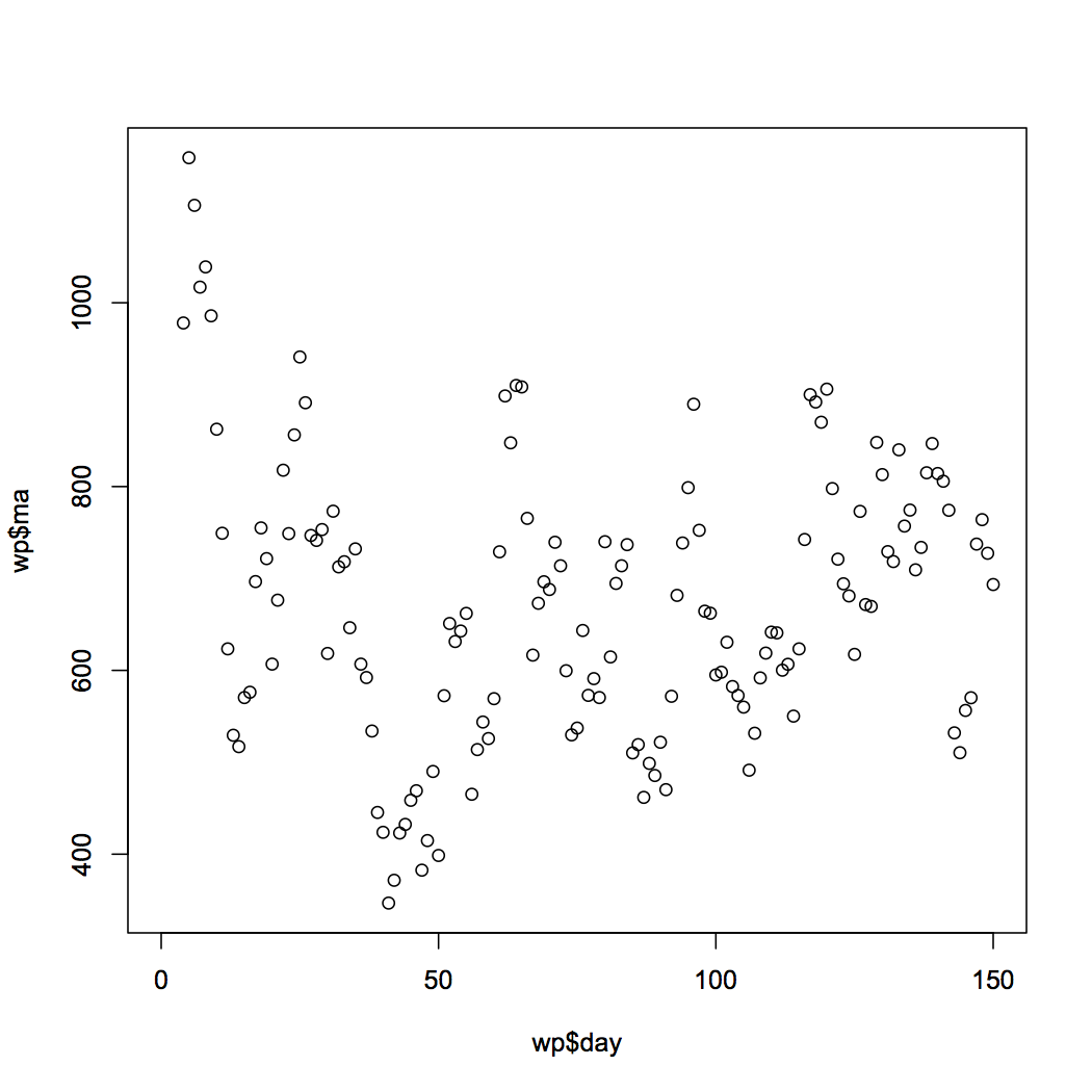
Moving Average versus post
Uh, no. In fact, this one is worse for overall correlation. So there’s no real pattern here at all but there might be something lurking in the fine detail, because you can just about make out some peaks and troughs. (In fact, mucking around with the moving average window does show a pattern that I’ll talk about later.)
However, those of who you are used to reading graphs will have noticed something about the axis label for the x-axis. It’s labelled as wp$day. This would imply that I was plotting post day versus average or count and, of course, I’m not. There have not been 151 days since January the 1st, but there have been days when I have posted multiple times. At the moment, for a number of reasons, this isn’t clear to the reader. More importantly, the day on which I post is probably going to have a greater influence on me as I will have different access to the Internet and time available. During SIGCSE, I think I posted up to 6 times a day. Somewhere, this is lost in the structure of the data that considers each post as an independent entity. They consume time and, as a result, a longer post on the same day will reduce the chances of another long post on the same day – unless something unusual is going on.
There is a lot more analysis left to do here and it will take more time than I have today, unfortunately. But I’ll finish it off next week and get back to you, in case you’re interested.
What do I need to do next?
- Relabel my graphs so that it is much clearer what I am doing.
- If I am looking for structure, then I need to start looking at more obvious influences and, in this case, given there’s no other structure we can see, this probably means time-based grouping.
- I need to think what else I should include in determining a pattern to my posts. Weekday/weekend? Maybe my own calendar will tell me if I was travelling or really busy?
- Establish if there’s any reason for a pattern at all!
As a final note, novels ‘officially start at a count of 40,000 words, although they tend to fall into the 80-100,000 range. So, not only have I written a novel in the past 4 months, I am most likely on track to write two more by the end of the year, because I will produce roughly 160-180,000 more words this year. This is not the year of blogging, this is the year of a trilogy!
Next year, my blog posts will all be part of a rich saga involving a family of boy wizards who live on the wrong side on an Ice Wall next to a land that you just don’t walk into. On Mars. Look for it on Amazon. Thanks for reading!
No More Page 3 Girls
Posted: May 3, 2012 Filed under: Education | Tags: education, higher education, news, reflection, teaching, teaching approaches Leave a commentYou are probably wondering where today’s post is going. (If you’re not from certain parts of the world you’re probably wondering what I’m talking about!) So let me briefly explain, first, what a Page 3 girl is and, secondly, what I’m talking about.
Back in 1969, Rubert Murdoch relaunched the Sun newspaper in the UK and put “glamour models” on Page 3. They were clothed, with a degree of suggestive reveal. Why Page 3? Because it’s the first page you see AFTER you open the newspaper. When it’s sitting on the shelf, you can’t see what’s on Page 3 – but, once you do pick it up, you can get to the glamour models pretty quickly.
(Yes, you’ve probably worked out what kind of newspaper the Sun was. If you haven’t run into the word tabloid yet, now is a good time to check it out.)
In late 1970, to celebrate the newspaper’s first anniversary, the Sun ran its first ‘nude’ model with a topless girl. And, forty years later, they’re still at it. So, that’s a Page 3 girl – but why am I talking about it?
Because our way of reading news has changed.
Newspapers, while still around, are in the process of moving to alternative delivery mechanisms. It will probably be relatively soon that we won’t have a page 3 because we have exclusively hyperlinked sources – a front page, decided by editorial committee but strongly influenced by click monitoring and how the users explore the space. Before the Internet, stories that were to be buried could be put on page 32, between boring sports and public notices. Now, you have to saturate your users in stories and hope that they won’t find it – or be accused that you’re not reporting all stories. Of course, once people find it, they can now link directly, share, restructure and construct your own stories.
On the Internet, there are no page numbers, only connections – and the connections are mutable.
So, no more Page 3, although there will not be an end to unfortunate pop-up images of women and questionable content, and there will be no end to people trying to hide stories or manipulate links in a way that achieves the same aims as burying. But we have entered a time when we can bypass all of this and then share the information on how to get the information, without all of that getting in the way.
(And, of course, we enter a time of clickjacking, misleading searches, commercial redirection and other nonsense. Hey, I never said that the time after Page 3 girls was going to solve everything! Come back in 10 years and we’ll talk about the new possibilities.)
Saving Lives With Pictures: Seeing Your Data and Proving Your Case
Posted: May 2, 2012 Filed under: Education | Tags: advocacy, analytics, authenticity, cholera outbreak, data visualisation, design, education, higher education, learning, teaching, teaching approaches, voronoi 1 Comment
From Wikipedia, original map by John Snow showing the clusters of cholera cases in the London epidemic of 1854
This diagram is fascinating for two reasons: firstly, because we’re human, we wonder about the cluster of black dots and, secondly, because this diagram saved lives. I’m going to talk about the 1854 Broad Street Cholera outbreak in today’s post, but mainly in terms of how the way that you represent your data makes a big difference. There will be references to human waste in this post and it may not be for the squeamish. It’s a really important story, however, so please carry on! I have drawn heavily on the Wikipedia page, as it’s a very good resource in this case, but I hope I have added some good thoughts as well.
19th Century London had a terrible problem with increasing population and an overtaxed sewerage system. Underfloor cesspools were overfilling and the excess was being taken and dumped into the River Thames. Only one problem. Some water companies were taking their supply from the Thames. For those who don’t know, this is a textbook way to distribute cholera – contaminating drinking water with infected human waste. (As it happens, a lack of cesspool mapping meant that people often dug wells near foul ground. If you ever get a time machine, cover your nose and mouth and try not to breath if you go back before 1900.)
But here’s another problem – the idea that germs carried cholera was not the dominant theory at the time. People thought that it was foul air and bad smells (the miasma theory) that carried the bugs. Of course, from this century we can look back and think “Hmm, human waste everywhere, bugs everywhere, bad smells everywhere… ohhh… I see what you did there.” but this is from the benefit of early epidemiological studies such as those of John Snow, a London physician of the 19th Century.
John Snow recorded the locations of the households where cholera had broken out, on the map above. He did this by walking around and talking to people, with the help of a local assistant curate, the Reverend Whitehead, and, importantly, working out what they had in common with each other. This turned out to be a water pump on Broad Street, at the centre of this map. If people got their water from Broad Street then they were much more likely to get sick. (Funnily enough, monks who lived in a monastery adjacent to the pump didn’t get sick. Because they only drank beer. See? It’s good for you!) John Snow was a skeptic of the miasma theory but didn’t have much else to go on. So he went looking for a commonality, in the hope of finding a reason, or a vector. If foul air wasn’t the vector – then what was spreading the disease?
Snow divided the map up into separate compartments that showed the pump and compartment showed all of the people for whom this would be the pump that they used, because it was the closest. This is what we would now call a Voronoi diagram, and is widely used to show things like the neighbourhoods that are serviced by certain shops, or the impacts of roads on access to shops (using the Manhattan Distance).

A Voronoi diagram from Wikipedia showing 10 shops, in a flat city. The cells show the areas that contain all the customers who are closest to the shop in that cell.
What was interesting about the Broad Street cell was that its boundary contained most of the cholera cases. The Broad Street pump was the closest pump to most people who had contracted cholera and, for those who had another pump slightly closer, it was reported to have better tasting water (???) which meant that it was used in preference. (Seriously, the mind boggles on a flavour preference for a pump that was contaminated both by river water and an old cesspit some three feet away.)
Snow went to the authorities with sound statistics based on his plots, his interviews and his own analysis of the patterns. His microscopic analysis had turned up no conclusive evidence, but his patterns convinced the authorities and the handle was taken off the pump the next day. (As Snow himself later said, not many more lives may have been saved by this particular action but it gave credence to the germ theory that went on to displace the miasma theory.)
For those who don’t know, the stink of the Thames was so awful during Summer, and so feared, that people fled to the country where possible. Of course, this option only applied to those with country houses, which left a lot of poor Londoners sweltering in the stink and drinking foul water. The germ theory gave a sound public health reason to stop dumping raw sewage in the Thames because people could now get past the stench and down to the real cause of the problem – the sewage that was causing the stench.
So John Snow had encountered a problem. The current theory didn’t seem to hold up so he went back and analysed the data available. He constructed a survey, arranged the results, visualised them, analysed them statistically and summarised them to provide a convincing argument. Not only is this the start of epidemeology, it is the start of data science. We collect, analyse, summarise and visualise, and this allows us to convince people of our argument without forcing them to read 20 pages of numbers.
This also illustrates the difference between correlation and causation – bad smells were always found with sewage but, because the bad smell was more obvious, it was seen as causative of the diseases that followed the consumption of contaminated food and water. This wasn’t a “people got sick because they got this wrong” situation, this was “households died, with children dying at a rate of 160 per 1000 born, with a lifespan of 40 years for those who lived”. Within 40 years, the average lifespan had gone up 10 years and, while infant mortality didn’t really come down until the early 20th century, for a range of reasons, identifying the correct method of disease transmission has saved millions and millions of lives.
So the next time your students ask “What’s the use of maths/statistics/analysis?” you could do worse than talk to them briefly about a time when people thought that bad smells caused disease, people died because of this idea, and a physician and scientist named John Snow went out, asked some good questions, did some good thinking, saved lives and changed the world.
Oh, Perry. (Our Representation of Intellectual Development, Holds On, Holds on.)
Posted: April 30, 2012 Filed under: Education | Tags: advocacy, authenticity, dualism, education, higher education, learning, measurement, multiplicity, perry, reflection, research, resources, teaching, teaching approaches 1 CommentI’ve spent the weekend working on papers, strategy documents, promotion stuff and trying to deal with the knowledge that we’ve had some major success in one of our research contracts – which means we have to employ something like four staff in the next few months to do all of the work. Interesting times.
One of the things I love about working on papers is that I really get a chance to read other papers and books and digest what people are trying to say. It would be fantastic if I could do this all the time but I’m usually too busy to tear things apart unless I’m on sabbatical or reading into a new area for a research focus or paper. We do a lot of reading – it’s nice to have a focus for it that temporarily trumps other more mundane matters like converting PowerPoint slides.
It’s one thing to say “Students want you to give them answers”, it’s something else to say “Students want an authority figure to identify knowledge for them and tell them which parts are right or wrong because they’re dualists – they tend to think in these terms unless we extend them or provide a pathway for intellectual development (see Perry 70).” One of these statements identifies the problem, the other identifies the reason behind it and gives you a pathway. Let’s go into Perry’s classification because, for me, one of the big benefits of knowing about this is that it stops you thinking that people are stupid because they want a right/wrong answer – that’s just the way that they think and it is potentially possible to change this mechanism or help people to change it for themselves. I’m staying at the very high level here – Perry has 9 stages and I’m giving you the broad categories. If it interests you, please look it up!

(Image from geniustypes.com.)
We start with dualism – the idea that there are right/wrong answers, known to an authority. In basic duality, the idea is that all problems can be solved and hence the student’s task is to find the right authority and learn the right answer. In full dualism, there may be right solutions but teachers may be in contention over this – so a student has to learn the right solution and tune out the others.
If this sounds familiar, in political discourse and a lot of questionable scientific debate, that’s because it is. A large amount of scientific confusion is being caused by people who are functioning as dualists. That’s why ‘it depends’ or ‘with qualification’ doesn’t work on these people – there is no right answer and fixed authority. Most of the time, you can be dismissed as having an incorrect view, hence tuned out.
As people progress intellectually, under direction or through exposure (or both), they can move to multiplicity. We accept that there can be conflicting answers, and that there may be no true authority, hence our interpretation starts to become important. At this stage, we begin to accept that there may be problems for which no solutions exist – we move into a more active role as knowledge seekers rather than knowledge receivers.
Then, we move into relativism, where we have to support our solutions with reasons that may be contextually dependant. Now we accept that viewpoint and context may make which solution is better a mutable idea. By the end of this category, students should be able to understand the importance of making choices and also sticking by a choice that they’ve made, despite opposition.
This leads us into the final stage: commitment, where students become responsible for the implications of their decisions and, ultimately, realise that every decision that they make, every choice that they are involved in, has effects that will continue over time, changing and developing.
I don’t want to harp on this too much but this indicates one of the clearest divides between people: those who repeat the words of an authority, while accepting no responsibility or ownership, hence can change allegiance instantly; and those who have thought about everything and have committed to a stand, knowing the impact of it. If you don’t understand that you are functioning at very different levels, you may think that the other person is (a) talking down to you or (b) arguing with you under the same expectation of personal responsibility.
Interesting way to think about some of the intractable arguments we’re having at the moment, isn’t it?
More on our image – and the need for a revamp.
Posted: April 28, 2012 Filed under: Education | Tags: ALTA, curriculum, design, education, higher education, reflection, teaching, teaching approaches 4 CommentsToday, in between meetings with people about forming a cohesive ICT community and defining our identity, I saw a billboard as I walked along the streets of the Melbourne CBD.
A picture of a woman’s torso, naked except for a bra, with the slogan “Who said engineering was boring?”
Says it all, really, doesn’t it? I’ve long said that associating a verb in a sentence with a negative is the best way to get people to think about the verb rather than the more complex semantics of the negated verb. Now, for a whole lot of people, a vaguely leery billboard is going to put the words “engineering” and “boring” together.
Some of these people will be young people in our target recruitment group – mid to late school – and this kind of stuff sticks.
The building the billboard was on was built by civil engineers, using systems designed by mechanical and electronic/electrical engineers, the pictures were produced on machines constructed by computer systems engineers and elecs, images constructed and edited through digital cameras by tech-savvy photographers and processed on systems built by software engineers, computer scientists, electronic artists and many, many other people who are all being insulted by the same poster they helped to support and create. (My apologies because I didn’t list everybody, but the sheer scale of the number of people who contributed to that is quite large!)
Today, on my way home, a giant hunk of steel, powered by two big balls of spinning flame, climbed up into the sky and, in an hour, crossed a distance that used to take weeks to traverse. Right now, I am communicating with you around the world using a machine built of metal, burnt oil residue and sand, that is sending information to you at nearly the speed of light, wherever you happen to be.
How, in anyone’s perverted lexicon, can that be anything other than exciting?
Identity and Community – Addressing the ICT Education Community
Posted: April 27, 2012 Filed under: Education | Tags: advocacy, ALTA, education, feedback, higher education, reflection, teaching, teaching approaches Leave a commentHad a great meeting at Swinburne University, (Melbourne, Victoria, Australia), today as part of my ALTA Fellowship role. I brought the talk and early outcomes from the ALTA Forum in Queensland into (sunny-ish?) Melbourne and shared it with a new group of participants.
I haven’t had time to write my notes up yet but the overall sentiment was pretty close to what was expressed at the ALTA Forum initially:
- We don’t have an “ICT is…” identity that we can point to. Dentists do teeth. Doctors heal the sick. Lawyers do law. ICT does… what?
- We need a common dissemination point for IT, CS, IS, ICT, CS-EE… etc. rather than the piecemeal framework we currently have that is strongly aligned with subdivision of the discipline.
- We need professionalism in learning and teaching, where people dedicate time to improve their L&T – no more stagnant courses!
- We need to have enough time to be professional! L&T must be seen as valuable and be allocated enough time to be undertaken properly.
- It would be great to have a Field of Research Code for Education within the Discipline of ICT – as distinct from general education coding – to make sure that CS Ed/ICT Ed is seen as educational research in the discipline, rather than a non-specific investigation.
- We need to identify and foster a community of practice to get out of the silos. Let’s all agree that we want to do this properly and ignore school and University boundaries.
- We need to stop talking about the lack of national community and start addressing the lack of a national community.
So a good validation for the early work at the Forum and I’m really looking forward to my meeting at RMIT tomorrow. Thanks, Graham and Catherine, for being so keen to host the first official ALTA engagement and dissemination event!
Big Data, Big Problems
Posted: April 26, 2012 Filed under: Education | Tags: education, higher education, learning, PhD, reflection, teaching, teaching approaches Leave a commentMy new PhD student joined our research group on Monday last week (Hi, T) and we’ve already tried to explode his brain by discussing every possible idea that we’ve had about his project area – that we’ve developed over the last year, but that we’ve presented to him in the past week.
He’s still coming to meetings, which is good, because it means that he’s not dead yet. The ideas that we’re dealing with are fairly interesting and build upon some work that I’ve spoken about earlier, where we’ve looked at student data that we happen to have to see if we can determine other behaviours, predict GPA, or get an idea of the likelihood of the student completing their studies.
Our pilot research study is almost written up for submission this Sunday but, like all studies that are conducted after the collection time, we only have the data that was collected rather than the ideal set of data that we would like to collect. That’s one of the things that we’ve given T to think about – what is the complete set of student data that we could collect if we could collect everything?
If we could collect everything, what would be useful? What is duplicated within the collection set? Which of these factors has an impact on things that we care about, like student participation, engagement, level of achievement and development of discipline skills? How can I collect them and store them so that I not only can look at the data in light of today’s thinking but that, twenty years from now, I can completely re-evaluate the data set in different frameworks?
There’s a lot of data out there, there are many ways of collecting, and there are lots of projects in operation. But there are also lots and lots of problems: correlations to find, factors to exclude, privacy and ethical considerations to take into account, storage systems to wrestle with and, at the end of the day, a giant validation issue to make sure that what we’re doing is fundamentally accurate and useful.
I’ve written before about the data deluge but, even when we restrict our data crawling to one small area, it’s sometimes easy to lose track of how complicated our world is and how many pieces of data we can collect.
Fortunately, or unfortunately, for T, there are many good and bad examples to look at, many studies that didn’t quite achieve what was wanted, and a lot of space for him to explore and define his own research. Now if I could only put aside that much time for my own research.
Got Vygotsky?
Posted: April 25, 2012 Filed under: Education | Tags: Csíkszentmihályi, curriculum, design, education, flow, games, higher education, learning, principles of design, resources, teaching, teaching approaches, tools, vygotsky, Zone of proximal development, ZPD 4 CommentsOne of my colleagues drew my attention to an article in a recent Communications of the ACM, May 2012, vol 55, no 5, (Education: “Programming Goes to School” by Alexander Repenning) discussing how we can broaden participation of women and minorities in CS by integrating game design into middle school curricula (Thanks, Jocelyn!). The article itself is really interesting because it draws on a number of important theories in education and CS education but puts it together with a strong practical framework.
There’s a great diagram in it that shows Challenge versus Skills, and clearly illustrates that if you don’t get the challenge high enough, you get boredom. Set it too high, you get anxiety. In between the two, you have Flow (from Csíkszentmihályi’ s definition, where this indicates being fully immersed, feeling involved and successful) and the zone of proximal development (ZPD).

Extract of Figure from A. Repenning, "Programming Goes to School", CACM, 55, 5, May, 2012.
Which brings me to Vygotsky. Vgotsky’s conceptualisation of the zone of proximal development is designed to capture that continuum between the things that a learner can do with help, and the things that a learner can do without help. Looking at the diagram above, we can now see how learners can move from bored (when their skills exceed their challenges) into the Flow zone (where everything is in balance) but are can easily move into a space where they will need some help.
Most importantly, if we move upwards and out of the ZPD by increasing the challenge too soon, we reach the point where students start to realise that they are well beyond their comfort zone. What I like about the diagram above is that transition arrow from A to B that indicates the increase of skill and challenge that naturally traverses the ZPD but under control and in the expectation that we will return to the Flow zone again. Look at the red arrows – if we wait too long to give challenge on top of a dry skills base, the students get bored. It’s a nice way of putting together the knowledge that most of us already have – let’s do cool things sooner!
That’s one of the key aspects of educational activities – not they are all described in terms educational psychology but they show clear evidence of good design, with the clear vision of keeping students in an acceptably tolerable zone, even as we ramp up the challenges.
One the key quotes from the paper is:
The ability to create a playable game is essential if students are to reach a profound, personally changing “Wow, I can do this” realization.
If we’re looking to make our students think “I can do this”, then it’s essential to avoid the zone of anxiety where their positivity collapses under the weight of “I have no idea how anyone can even begin to help me to do this.” I like this short article and I really like the diagram – because it makes it very clear when we overburden with challenge, rather than building up skill and challenge in a matched way.
The Unhappiest Bartender in Australia
Posted: April 24, 2012 Filed under: Education | Tags: advocacy, authenticity, education, higher education, reflection, teaching, teaching approaches Leave a comment
I’m not talking about students for this one, I’m talking about the scientific community. On reading yet more articles about the growing rate of retraction, on top of the inability to replicate key studies, it appears that we are at risk of losing our way. I need to be able to train my students for the world that they will work in – so I’m going to briefly discuss my beliefs and interview myself to talk about my fears of what happens when scientific integrity is trumped by mercenary and short-sighted values.
The executive summary is “Do science properly or do something else.” If you’re already practising science at a high level, with integrity, please leave work early and enjoy a beverage of your choice, at your own expense. I salute you! Come back and read this once you are refreshed. (This is a bit more opinionated than usual, so if you want to focus on my Learning and Teaching posts, you might want to read some of my previous posts or come back tomorrow. I welcome you to stay, however.)
I understand, to an extent, why people are taking questionable approaches to their work in order to achieve publication in the same that I understand why students cheat sometimes. But comprehending the rationalisation does not mean that I condone the actions – far from it. In another blog I commented on the fact that some people change their behaviour when they drink. If they are aware that this is going to happen, then the excuse “I was drunk” is not an excuse. Getting drunk was an enabling step. If your choices, as a scientist, are leading you down dark paths then you have to look at the end of that path to see where you’re going. “That was where my path naturally led” isn’t valid when you know that you’re on the wrong road.
I’m pretty worried by some of the behaviour that people are practising to get ahead. But don’t think that I’m in a strong enough position that I’m immune to the lure of the dark path – I want to keep my job, make good progress, get promoted, get grants, have an impact. Like everyone else, I want to change the world. The question is “What are you prepared to compromise in order to get to that stage?”
Do I feel pressure to publish? Yes! Am I willing to fabricate data to do so? No. Am I willing to cite ‘suggested papers’ that all appear to be from the editor of the special edition or a select group of friends? No. Am I willing to run an experiment 100 times and write up the single time it worked as if this was a general case? No!
But, wait, if you don’t meet your publication targets, doesn’t that have an impact on your career? Yes, possibly. I’m expected to publish at a very high level on a regular basis.
And if you don’t? Well, I can demonstrate my worth in other ways but research turns into publications, publications support grants, grants bring in people, people do research. Not publishing will have a serious impact on my ability to produce research.
So you’d bend a little because it’s in the greater interest for your work to be published because your research is valuable. Nice try, but no. I’d prefer to leave my job than compromise my principles in this regard.
Well, it’s really nice that you’ve got that level of agency but, hey, your wife has a stable income and the wolf isn’t at your door. Aren’t you just making an argument from privilege? Hmmm.
Well, that’s a good question. My response would normally be that there are many, many jobs that use some of what I have that don’t require me to have a strong set of scientific and personal ethics. I could teach computing courses and never have to worry about research ethics. I could write code as a small cog in a large company and not have to worry as much about experimental replication. I could tend bar, I guess, or maybe work in a shop, if jobs like that still exist in 10 years time and they’ll hire a 50 year old. But, again, this assumes a level of skill transferability and agency that does presume a basis of privilege if I’m going to walk away from science and do something else.
But this assumes that you went in to be a scientist thinking that this kind of bad behaviour is just what scientists did, that ethics were optional, that publication by any means was acceptable – that reality was mutable when deadlines were tight. Let’s break this thinking now because I don’t want any students to come to my program thinking like that.
I believe that if you want to be a scientist, you have to accept that this comes with a package of ethical behaviours that are not optional.
Science has impact! Building on bad science gives you more bad science. This bad behaviour in science could be, and probably is, killing people. We’re potentially setting back scientific progress because of time wasted trying to build on experiments that don’t work. We are in the middle of a data deluge and picking from the many correct things is hard enough, without adding deceitful or misleading publications as well.
What concerns me, reading about increasing retraction rates and dodgy surveys, is that the questionable path to success may become the norm. People are already questioning perfectly good science, because of a growing mistrust fuelled by bad scientific behaviour, and “Well, I don’t know” is a de rigeur rejoinder in certain parts of the blogosphere.
I always talk about authenticity because it’s the backbone of my teaching. I have to believe it, or know it, or it just won’t work with the students. The day I think that our community is lost, I’ll no longer be able to train students to go to the fantasy land that I naively thought was reality and I’ll quit.
Come and find me, if I do, I’ll probably be working in a bar – and looking really unhappy.


